Table of Contents
ToggleAre you sublimation geeks looking for accurate colors in your sublimation prints? Our article cuts straight to the chase, providing you with a practical understanding of sublimation color chart! Learn all about why they’re key to matching screen colors to prints, the different types available for your projects, and how to select and apply them effectively to avoid any guesswork and frustrations in color matching. Look no further and take a dive into a stunning sublimation adventure!
Key Takeaways
- Sublimation color charts are essential for ensuring color accuracy from digital design to physical print, reducing waste, and maintaining color consistency across various materials.
- Creating your own sublimation color chart involves a process that includes selecting suitable colors and designing a helpful layout, while considering technical aspects like color modes and ICC profiles.
- Software like Photoshop, CorelDRAW, and Cricut Design Space can be used to manage colors in sublimation printing, while regularly calibrating your printer and properly adjusting colors ensures high-quality, consistent outputs.[1]
Understanding Sublimation Color Charts

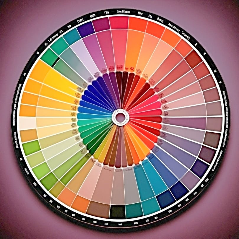
Sublimation color charts serve as the universal translator in the world of sublimation printing. Think of them as a cheat sheet, helping to ensure that the colors you see on your computer screen are the colors you get on your printed material.
The magic of these charts lies in their ability to:
- Remove guesswork and enhance color accuracy in your designs
- Help designers pick colors in design software using the printed color chart, eliminating any discrepancies between screen colors and printed colors
- Ensure that your artistic vision will translate perfectly onto your chosen material
The Role of Color Charts in Sublimation Printing

You may wonder how color charts contribute to sublimation printing. Their secret weapon is their capacity to guarantee color accuracy and uniformity. Utilizing a color chart ensures that the hues on your final printed substrate align with your original intention. This leads to vibrant and high-quality sublimation prints and also reduces waste and reprints, saving you time and resources.
Furthermore, color charts serve as a dependable guide for color matching and resolution of color-related issues. This reliability is key to preserving color uniformity in diverse printing tasks. Armed with a color chart, you can trust that your prints will maintain their consistency, irrespective of the material being printed on.
Types of Sublimation Color Charts
Having unraveled the function of color charts, let’s investigate the various types at our disposal. A few popular options include:
⫸ Click Here For Best Selling Sublimation Printers And Products ⫷- Printable color charts
- PANTONE Goe color charts
- Basic RGB color charts
- Custom-made color charts
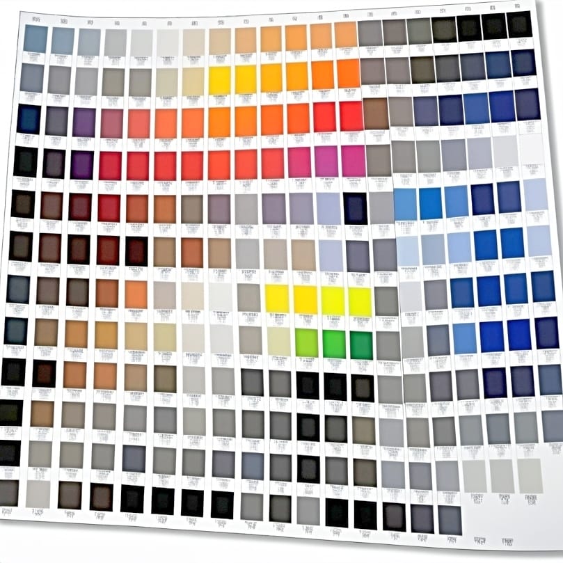
Each type of color chart serves a specific purpose. For instance, a Pantone color chart is used to ensure accurate color reproduction by providing a reference for designers to find the closest match to the color they desire. The type of color chart you choose depends on your specific needs, the accuracy of colors you’re aiming for, the size and format of the chart, and the printing method used.[2]
Creating Your Own Sublimation Color Chart

The process of crafting your own sublimation color chart involves the following steps:
- Brainstorm design ideas that suit your printing requirements.
- Select a graphic design tool to bring your ideas to life.
- Choose the colors you want to include in your color chart.
- Create a grid or table to organize your colors.
- Use your graphic design tool to fill in each cell of the grid with the corresponding color.
- Print out your color chart and keep it handy for reference.
This process allows you to customize your color palette and delve deeper into the intricacies of color dynamics. It can be an exhilarating pursuit for those interested in sublimation printing and looking to purchase the perfect color palette.
However, creating a sublimation color chart is not just about design; it also involves technical aspects like considering RGB and CMYK color modes, ICC color profiles, and the types of graphics you’ll be working with. Choosing colors that match a widely used color chart and your dyed stock fabric establishes a uniform reference point for precise color replication.
Selecting Colors for Your Chart
When it comes to selecting colors for your sublimation color chart, the goal is to choose colors that will serve your project requirements best. The colors you choose should be compatible with RGB and CMYK color modes, align with ICC color profiles, and be suitable for the types of graphics you’ll be using.
The range of colors you include in your chart should be extensive, covering light tones like whites, light grays, and pastels, ensuring you have a comprehensive range to meet different design needs. A meticulous selection of your colors forms the cornerstone for vivid and true-to-life color representation in your sublimation prints.
Designing the Chart Layout
Designing an effective layout for your color chart is as important as choosing the right colors. A well-organized chart with systematic color swatches or samples and their corresponding color codes or names makes it easy for you to select and match colors accurately.
In addition to organizing your chart, consider elements like:
- color harmony
- contrast
- balance
- emphasis
- example
To make your chart visually appealing and user-friendly, consider incorporating a link that leads to a well-designed color chart. Remember, a well-designed color chart not only aids in accurate color selection but also enhances the overall sublimation printing experience.
Utilizing Software Programs for Sublimation Color Management

As we navigate the digital age, technology takes on a pivotal role in managing sublimation colors. Several software programs offer features specifically designed to enhance color accuracy in sublimation printing. Some of these programs include:
- Photoshop: allows you to change the Color Handling to Photoshop Manages Colors and use its basic tools for sublimation projects
- CorelDRAW: offers advanced color management options and tools for sublimation printing
- Sawgrass Print Manager: a software specifically designed for sublimation printing, offering color management and optimization features
These software programs can greatly improve the color accuracy and quality of your sublimation prints, and some even offer free versions.
CorelDRAW, on the other hand, provides Document Color Management Settings that you can access through Tools > Color Management, ensuring accurate color output. Additionally, its support for customizable ICC profiles enables precise printing on white or brightly colored surfaces.
Photoshop for Sublimation Color Management
Photoshop offers a plethora of features for managing sublimation colors. You can integrate ICC profiles for accurate color reproduction and adjust colors using the Adjustments panel. When you entrust color management to Photoshop, you’re capitalizing on its advanced color management system to guarantee that your printed colors align with your design colors.
Furthermore, Photoshop allows you to adjust color balance and calibrate your printer for precise color management in prints. With the right settings and adjustments, Photoshop can ensure that your colors pop with vibrancy, making your final product look even better.[3]
CorelDRAW for Sublimation Color Management
CorelDRAW is another powerful tool for sublimation color management. It supports customizable ICC profiles, enabling precise printing on different surfaces. By accessing the Document Color Management Settings through Tools > Color Management, you can ensure accurate color output in your prints.
Moreover, CorelDRAW’s support for the RGB color model makes it a perfect choice for sublimation printing. Its features allow you to handle color transitions expertly, providing a more comprehensive and accurate color chart for your sublimation printing projects.[4]
Cricut Design Space for Sublimation Color Management
Cricut Design Space is another software that offers features for managing sublimation colors. It allows you to:
- Upload sublimation PNG files, crucial for color management
- In the print menu, select your sublimation printer
- Pick the right color profile or print quality
Cricut Design Space’s color management involves:
- Taking into account the specific printer
- The types of sublimation ink used
- Making sure to use the correct color profiles for both printer and paper to get the colors just right
By calibrating color settings and uploading the right file, you can ensure that your sublimation colors are managed accurately and effectively.
Tips for Perfecting Your Sublimation Prints

The accomplishment of flawless sublimation prints requires a delicate equilibrium of multiple elements. These encompass precise printer calibration, color testing and adjustment, alongside steady quality control. By following these steps, you ensure that your prints come out as vibrant and accurate as your original design.
Upholding uniform color quality is fundamental for the realization of impeccable sublimation prints. Regular printer maintenance, using the right equipment and sublimation supplies, and planning your inventory of sublimation blanks can significantly help in maintaining consistent color quality.
Calibrating Your Printer
The calibration of your sublimation printer is an essential step towards guaranteeing accurate color replication. It helps prevent color deviations and ensures the printed colors look just as they should. Regular calibration, such as before each print job or at least once a month, keeps the colors accurate and consistent.
The calibration process involves:
- Scanning the first print using a color calibration tool like ColorMunki and following on-screen directions for calibration.
- Adjusting print quality settings in the printer driver.
- Using color management tools to ensure that the colors on your monitor match the printed colors.
Testing and Adjusting Colors
The testing and adjustment of colors are vital steps towards realizing accurate color reproduction in sublimation printing. Some tools that can be handy for testing and adjusting colors are:
- ICC Profiles
- Printable color charts
- The black box test
- Color calibration designs like the Subliflower
- Online color matching tools
By setting the right color mode, using ICC profiles, and adjusting brightness in print settings, you can ensure that your colors are spot on in sublimation printing. Regular testing and adjustment of colors can significantly enhance the overall quality of your sublimation prints.
Maintaining Consistent Color Quality
Preserving constant color quality is paramount for the accomplishment of flawless sublimation prints. To do this, it’s important to:
- Understand the sizing spread of the order
- Do regular maintenance on the printhead
- Calibrate the printer properly
- Use a color chart to make sure the colors come out accurately.
In addition, the quality of your sublimation paper and the temperature during the heat press stage can significantly affect color consistency. By using high-quality paper and maintaining a consistent temperature during the heat press stage, you can ensure that your colors stay consistent across different printing jobs.
Troubleshooting Common Sublimation Color Issues

Despite meticulous efforts, color challenges may occasionally surface in sublimation printing. Faded colors and inaccurate color matching are common issues that can occur due to various reasons like using the wrong fabrics, low-quality coatings, subpar sublimation ink or paper, or incorrect heat settings.
The good news is that these issues can be fixed. Here are some steps you can take to address them:
- Tweak the time, temperature, and pressure settings when you transfer the design.
- Use the right fabrics for your transfer.
- Use high-quality materials for your transfer.
- Adjust your printer settings to ensure accurate color matching.
- Tweak the colors if necessary.
- Use the right color profiles for both printer and paper.
By following these instructions, you can bring life back to your faded colors and achieve accurate color matching.
Faded or Dull Colors
The cause of faded or lackluster colors may be attributed to the use of non-sublimation-friendly fabric or inferior quality sublimation paper and ink. To address these issues, you can adjust the time, temperature, and pressure settings during the transfer process and make sure you’re using the right fabrics and top-notch materials.
Temperature plays a crucial role during the heat press stage in sublimation printing. A slight change in temperature can affect the colors and details of the final image. Hence, it’s essential to keep the temperature consistent to maintain color consistency in sublimation printing.[5]
Inaccurate Color Matching
Inaccurate color matching can transpire for a variety of reasons, such as:
- Employing sublimation inks that appear lighter prior to transfer
- Improper pressure, timing, or temperature configurations during the transfer phase
- Incorrect print settings
To rectify this, you can:
- Set the right color profile in Epson Print Manager
- Make some adjustments to the color settings in Photoshop
- Use a color chart to help in accurate color matching, leading to enhanced color accuracy and consistency in your sublimation prints.
Summary

Sublimation printing is an art that requires precision, especially when it comes to color reproduction. By understanding and using color charts, calibrating your printer, testing and adjusting colors, and maintaining consistent color quality, you can create vibrant and accurate sublimation prints. While color issues may arise, they can be rectified with the right strategies and tools. So, go ahead and let your colors shine!
Frequently Asked Questions
What colors can you sublimate on?
The best apparel color for sublimation is white, but you can also print on light-colored garments as long as you don’t need the color white within the image. However, sublimation on colored apparel comes with concerns about colorfastness when washed.
Why is my sublimation print faded?
Your sublimation print may be faded due to excessive time, temperature, or pressure. Double-check the recommended settings from the company where you purchased your sublimation blanks as heat press settings can vary.
Why is color matching so important in sublimation printing?
Color matching is crucial in sublimation printing to accurately reproduce the desired colors in prints, ensuring high-quality and customer satisfaction.
How do I calibrate my sublimation printer?
To calibrate your sublimation printer, you can use a color calibration tool like ColorMunki to scan the first print and follow the on-screen directions for calibration. Then, adjust print quality settings in the printer driver and use color management tools to ensure the colors on your monitor match the printed colors.
What software can I use for sublimation color management?
You can use Photoshop, CorelDRAW, and Cricut Design Space for managing sublimation colors, as they offer features designed to enhance color accuracy in sublimation printing. Happy designing!
References
- The Multivision Studios. (2018b, March 7). Color management in sublimation Printing. https://www.linkedin.com/pulse/color-management-sublimation-printing-the-multivision-studios/
- LinkedIn Login, Sign in | LinkedIn. (n.d.). LinkedIn. https://www.linkedin.com/pulse/application-diversity-sublimation-printing-hanrunpaper/
- How to use Photoshop for beginners – learn the basics – Adobe. (n.d.). https://www.adobe.com/products/photoshop/how-to-use.html
- How-To Guides for graphic design & Photo Editing | CorelDRAW. (n.d.). https://www.coreldraw.com/en/learn/how-to/
- Amazon.com: Sublimation color protectant 200ml /7oz pre wash treatment. Fade Stopper : Arts, Crafts & Sewing. (n.d.). https://www.amazon.com/Sublimation-color-protectant-treatment-Stopper/dp/B09SFCFJJ5


